In the fast-paced world of incident management and performance monitoring, stakeholders need real-time insights to address service interruptions and manage resources efficiently. The client required a custom dashboard that would provide key performance metrics, track incidents, and enhance collaboration across internal and third-party teams. The challenge was to design a dashboard that was intuitive, clear, and actionable.
🧠 The Goal
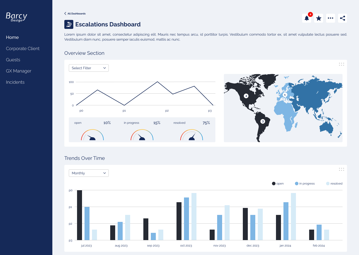
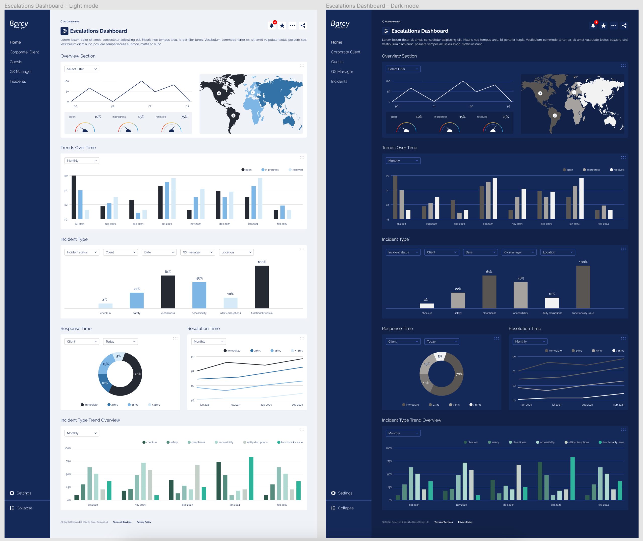
Streamline incident management by visualizing key metrics like response time, resolution time, incident severity, and assigned responsibilities
Provide a user-friendly interface for monitoring performance across teams
Align with company’s corporate identity, ensuring brand consistency while enhancing usability
Enable quick access to critical incident information to reduce response time
💼 My Role
As the lead designer, I was responsible for every aspect of the dashboard, from research to the final user interface. I collaborated closely with product stakeholders to understand business needs and technical requirements, ensuring the design was both functional and aligned with the client’s branding.
📊 Market Research & Benchmarking
I kicked off the project with a market analysis and competitor benchmarking to understand best practices in incident management tools. This helped identify:
Essential features that increase operational efficiency
Effective ways to display performance metrics
Visual hierarchies that allow users to focus on key priorities
I presented the findings to the client to ensure alignment on the core elements before diving into the design process.
🎨 UI Design & Prototyping
Starting with rough sketches, I iterated on different dashboard layouts that would offer easy navigation and data visualization. Once I had feedback from internal stakeholders, I created interactive prototypes in Figma. Key design elements included:
Clear visual hierarchies to prioritize key metrics (response time, resolution time, etc.)
Flexible components that could be customized for different user roles
Simple, intuitive charts and graphs to communicate complex data at a glance
My goal was to ensure that users could quickly take action on the most important incidents while having a high-level overview of ongoing performance.