Fettle, part of SH:24, provides discreet sexual health services by post. While its services were trusted and essential, the website’s experience lacked visual consistency, brand cohesion, and clarity across key pages, leading to a fragmented user journey.
The product, category, and team pages needed a redesign to improve engagement, and the error page needed a more helpful and brand-aligned tone.
🎯 The Goal
Improve user engagement and trust through better layout and messaging
Align UI with brand values of discretion, clarity, and care
Build reusable components to support design consistency
Strengthen collaboration across product and engineering teams
💡 My Role
As a Product Designer, I owned the responsive redesign of key marketing and informational pages:
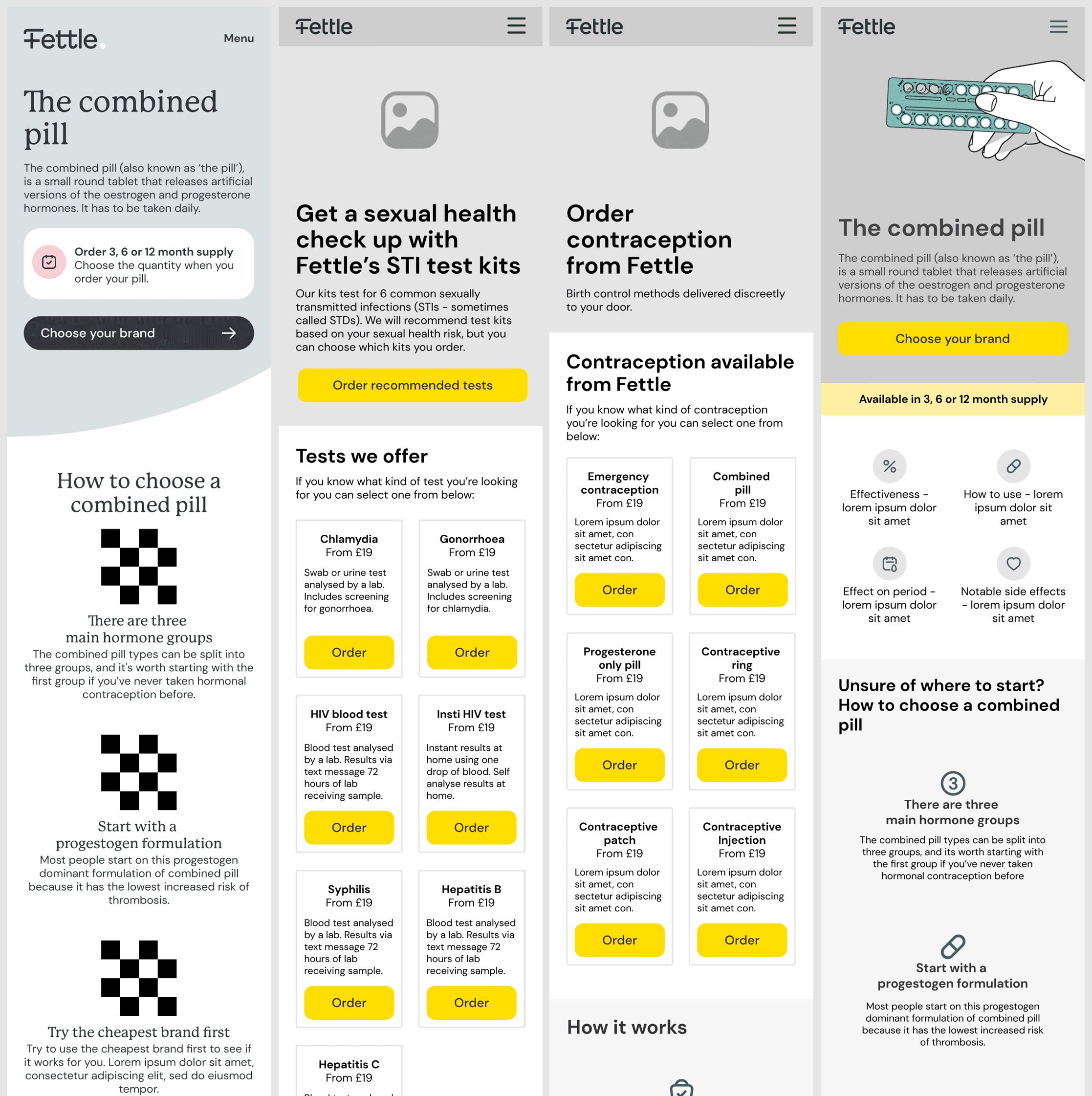
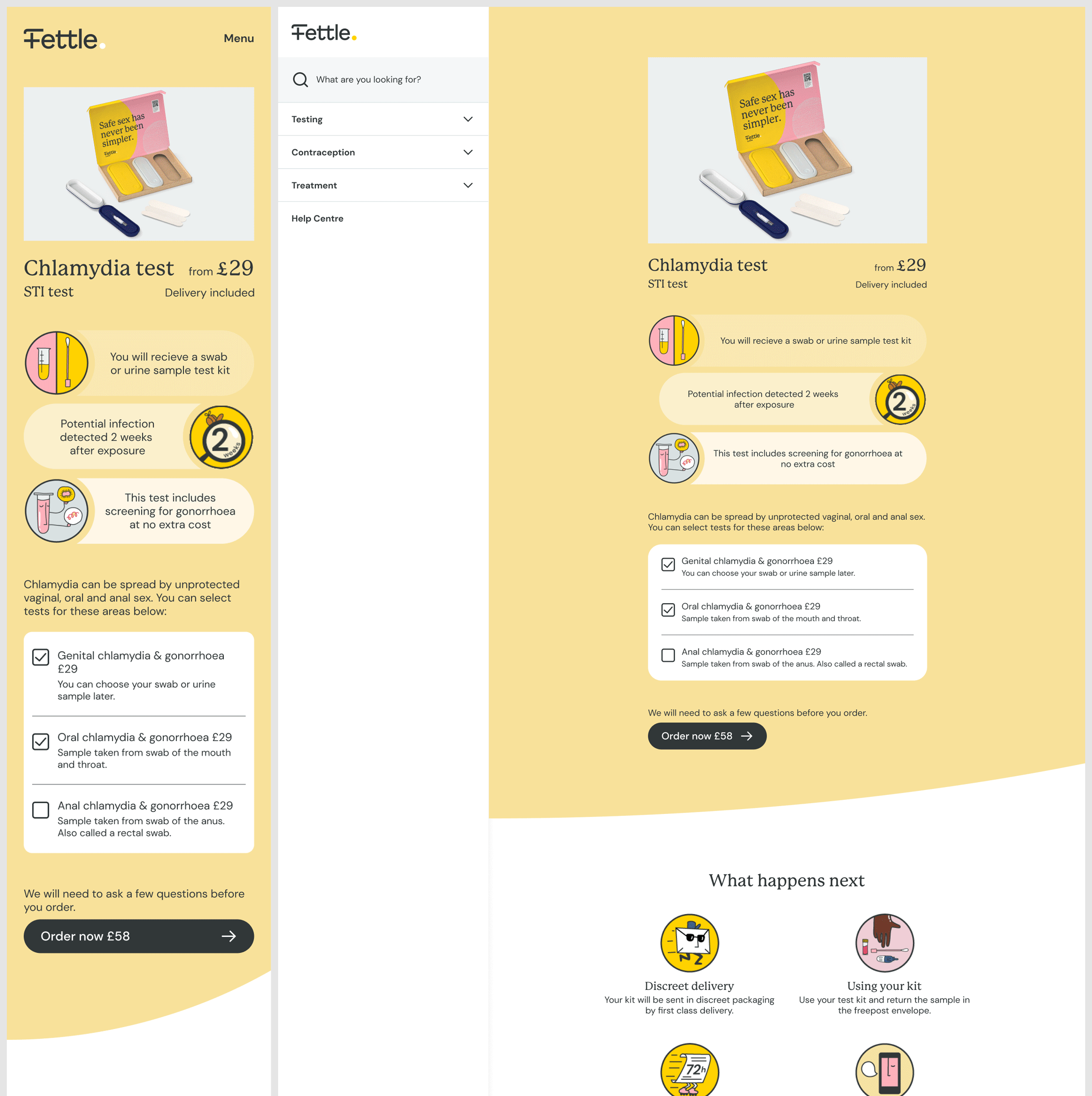
Product Page
Category Page
Our Team Page
Error Page
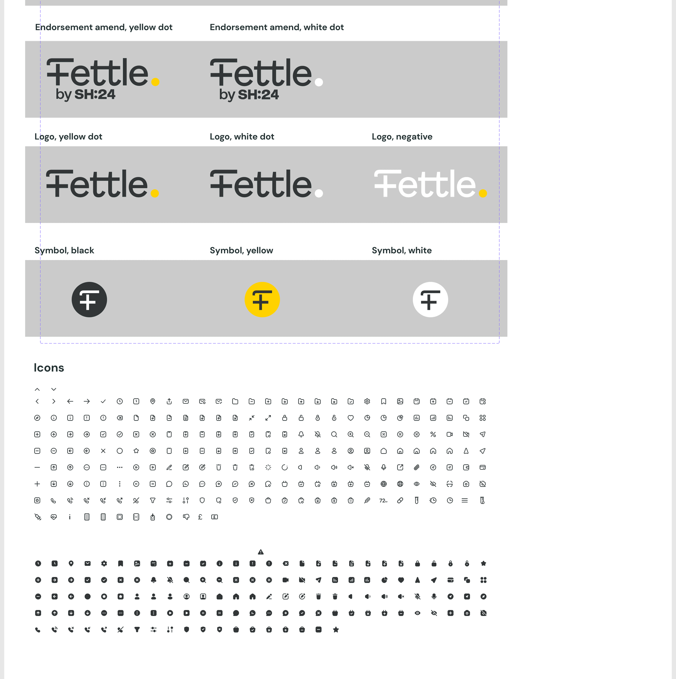
I also contributed to expanding the design system, ensuring visual consistency and dev-friendly handoff.
✍️ UX & Wireframes
I led the UX phase by creating wireframes for all 4 pages based on stakeholder input and business priorities.
Approach:
Simplified layouts to focus on content clarity
Improved information hierarchy
Designed for scalability, considering future service expansions
After multiple review rounds with stakeholders, the wireframes were finalized and approved for UI development.
📈 +15% increase in user engagement on redesigned product pages
✅ Delivered work accepted by the CEO and CTO with no revisions
🎨 Established strong design consistency across the site
⚙️ Created reusable components, improving speed for future design efforts
🧠 Reflections & Learnings
This project underscored the power of UI as a trust-building tool—especially for sensitive services like sexual health. By pairing thoughtful content hierarchy with brand-aligned visuals, I helped Fettle communicate more clearly and empathetically. It also reinforced the importance of design systems in scaling product design efficiently.