Digiturk users were receiving printed invoices, which often went unnoticed, leading to payment delays and customer service calls. The company aimed to:
Reduce the use of printed invoices
Encourage digital billing adoption
Offer a simple and accessible mobile experience
🎯 The Goal
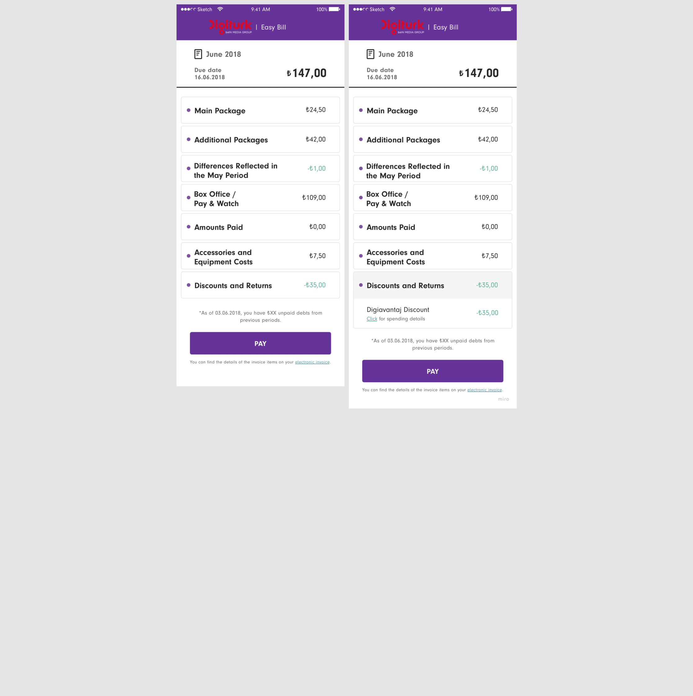
Design a mobile billing webpage that allows users to:
Quickly view and understand their bill
Pay via a seamless redirect to Digiturk’s payment portal
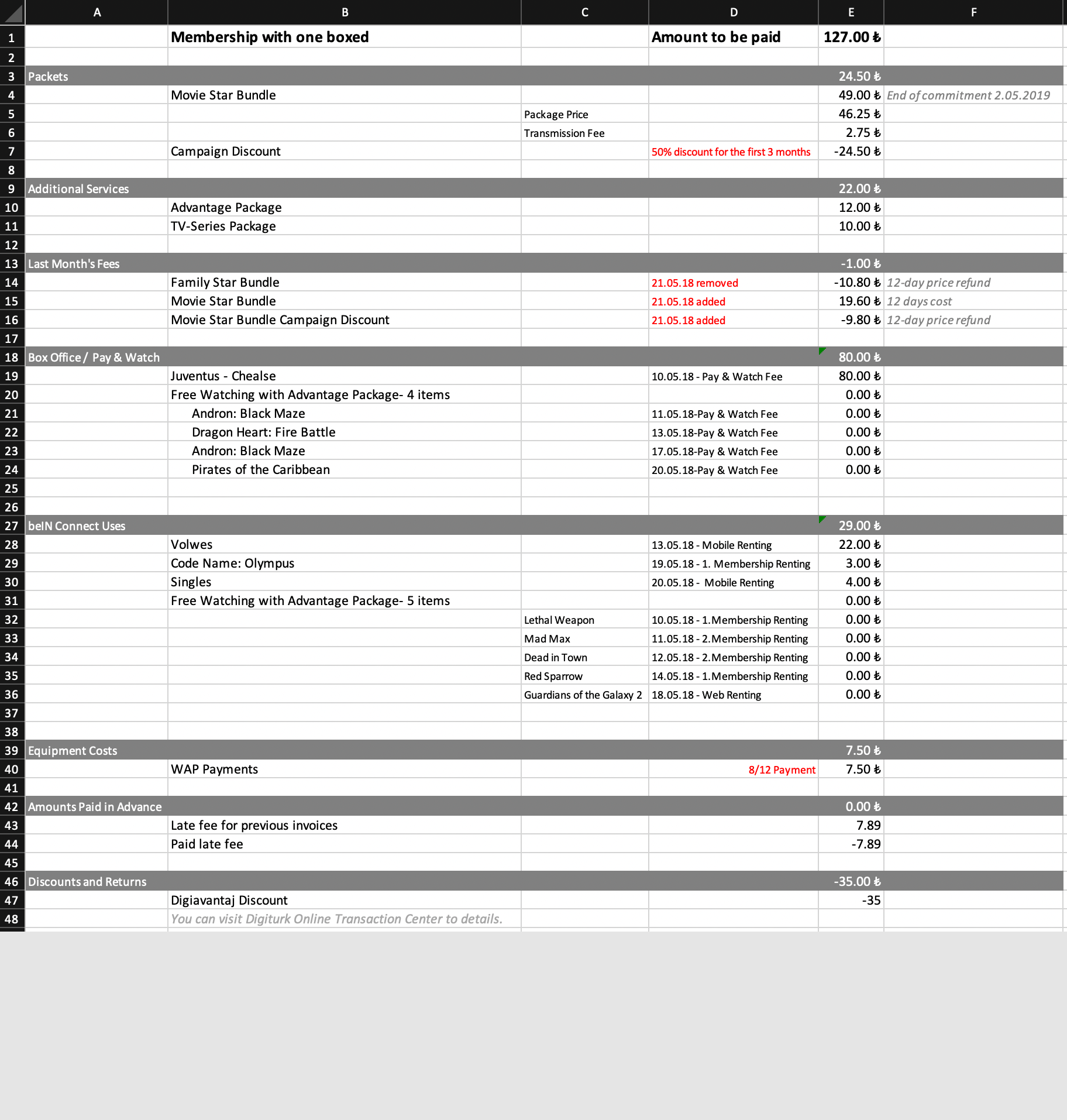
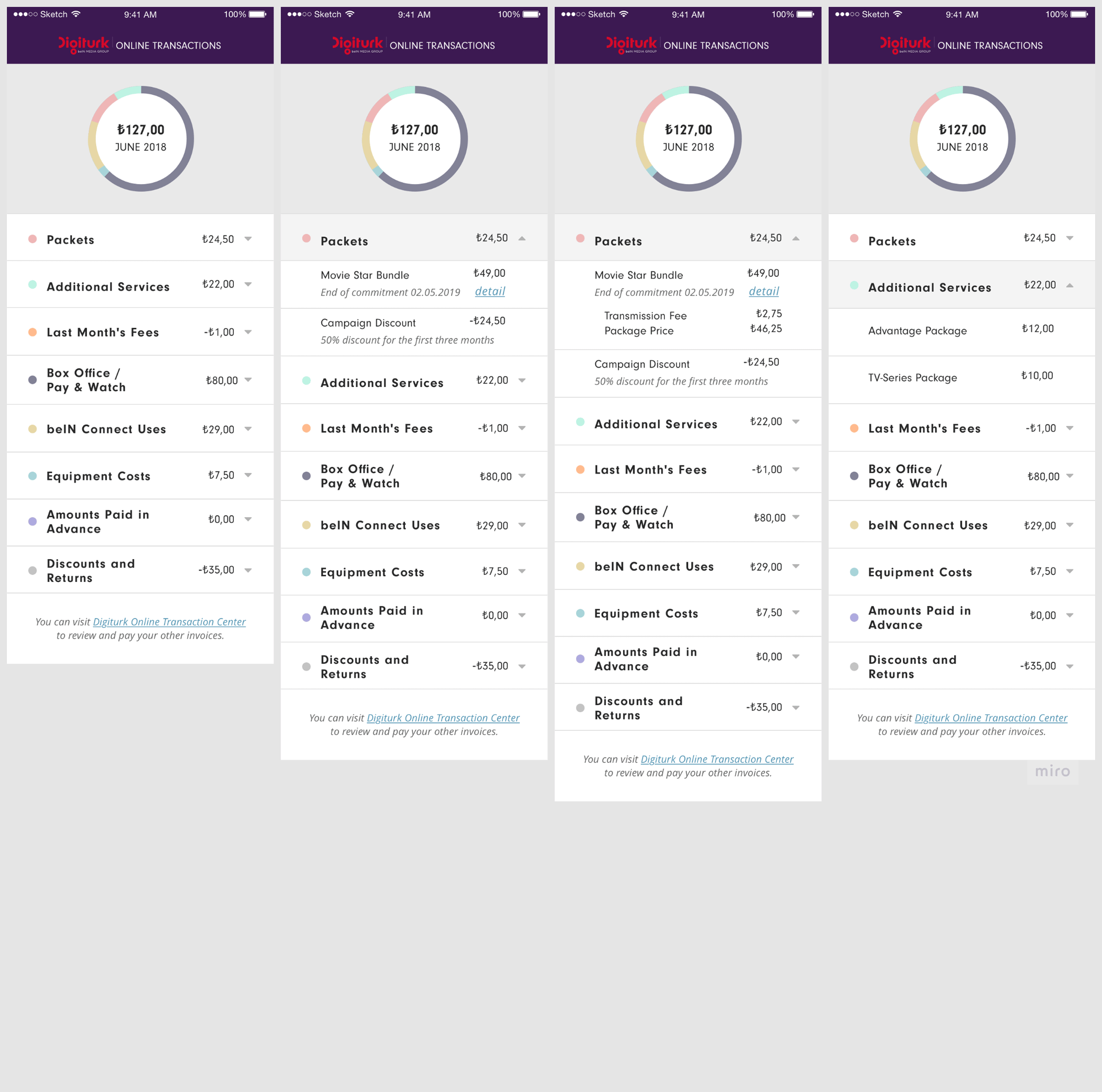
View key billing details like discounts, content charges, and multiple device usage
💡 My Role
As the Senior Product Designer, I led the end-to-end design process:
Conducted research and data analysis
Designed wireframes and prototypes
Facilitated stakeholder reviews
Ran user testing sessions
Finalized and delivered developer-ready designs via Zeplin
🔍 Discovery & Research
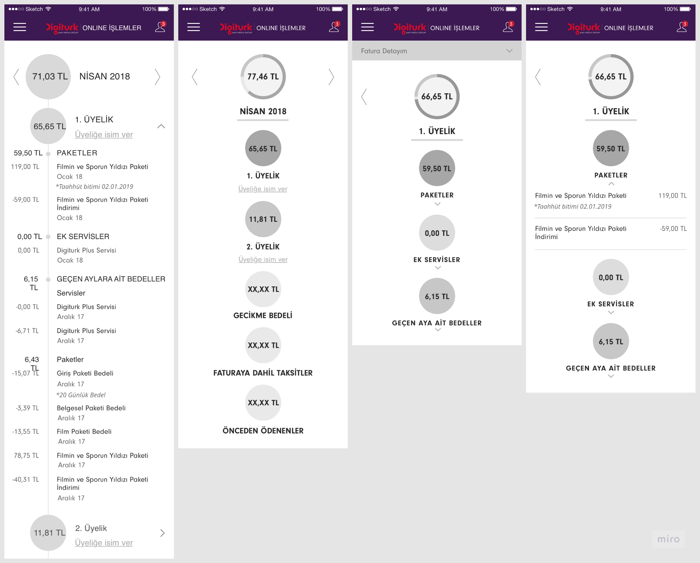
To understand user needs and billing complexities, I gathered real printed invoice samples from the finance department. A key insight emerged: 📌 Users with multiple set-top boxes had vastly different invoice structures, requiring a design flexible enough to support both single and multi-device households.
🎨 Design Process
1. Wireframes & Mockups
Created separate flows for single vs. multi-device households. Focused on:
Clean visual hierarchy
Clear CTAs
Collapsible sections for advanced details
2. Prototypes
Interactive prototypes were built for usability testing and stakeholder alignment. Feedback led to refinements around terminology and grouping logic.
🧪 User Research & Testing
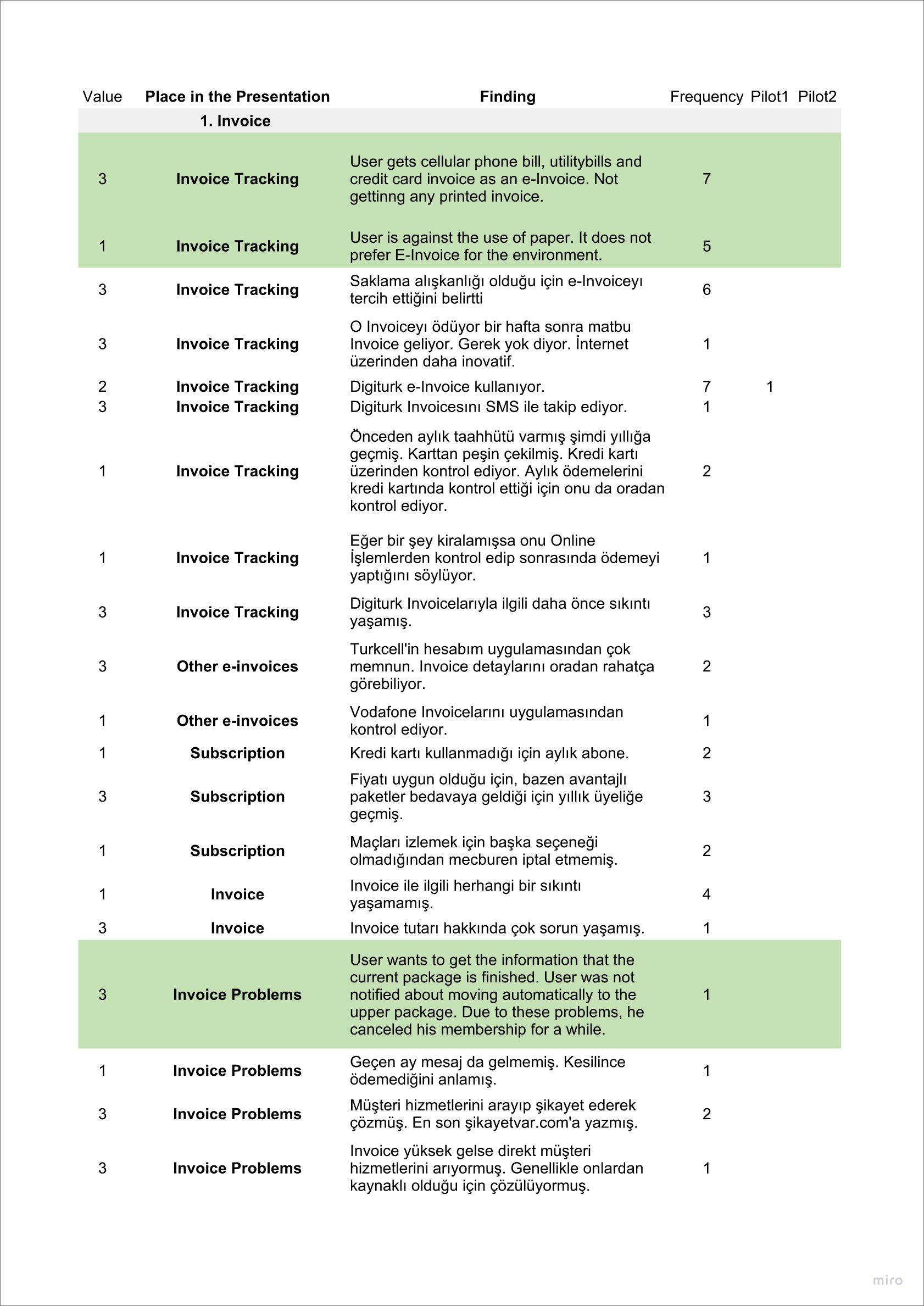
I interviewed 8 Digiturk users with targeted usability tests. I explored areas like:
Information hierarchy and clarity
Actionability of CTAs
Understanding of billing terms like “Additional Services” vs. “Packages”
Preferences on invoice details and grouping
🟢 Prioritized insights were identified and validated in collaboration with stakeholders.
✍️ Key Research Questions
Is the total amount to be paid clear and prominent?
How should discount campaigns be shown for clarity and trust?
Are users confident in taking action (e.g., clicking “Pay Now”)?
Should users see all the invoice details or just a summary first?
🎨 Design Process
3. Visual Design
Finalized high-fidelity designs in Sketch and handed off via Zeplin.
Used Digiturk’s brand palette for consistency
Ensured accessibility and responsive behavior
Created reusable UI components for scalability
📊 Results & Impact
✅ +50% increase in user engagement with digital invoices
✅ -25% drop in invoice-related user complaints
✅ Created a design system foundation for future Digiturk mobile tools
🧠 Reflections & Learnings
This project reinforced the power of user research and iteration. Small interface tweaks, like changing terminology and adding tooltips, significantly impacted usability. I also learned the value of cross-functional collaboration, especially with finance and customer support teams to deeply understand the problem.