Digiturk users were receiving printed invoices, which often went unnoticed, leading to payment delays and customer service calls. The company aimed to:
Design a mobile billing webpage that allows users to:
As the Senior Product Designer, I led the end-to-end design process:
To understand user needs and billing complexities, I gathered real printed invoice samples from the finance department. A key insight emerged:
📌 Users with multiple set-top boxes had vastly different invoice structures, requiring a design flexible enough to support both single and multi-device households.
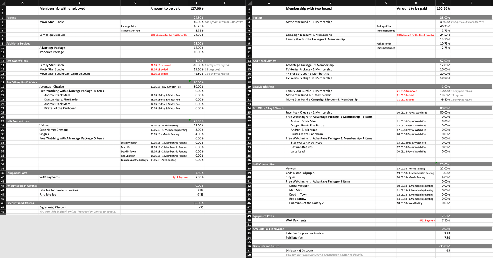
Created separate flows for single vs. multi-device households. Focused on:
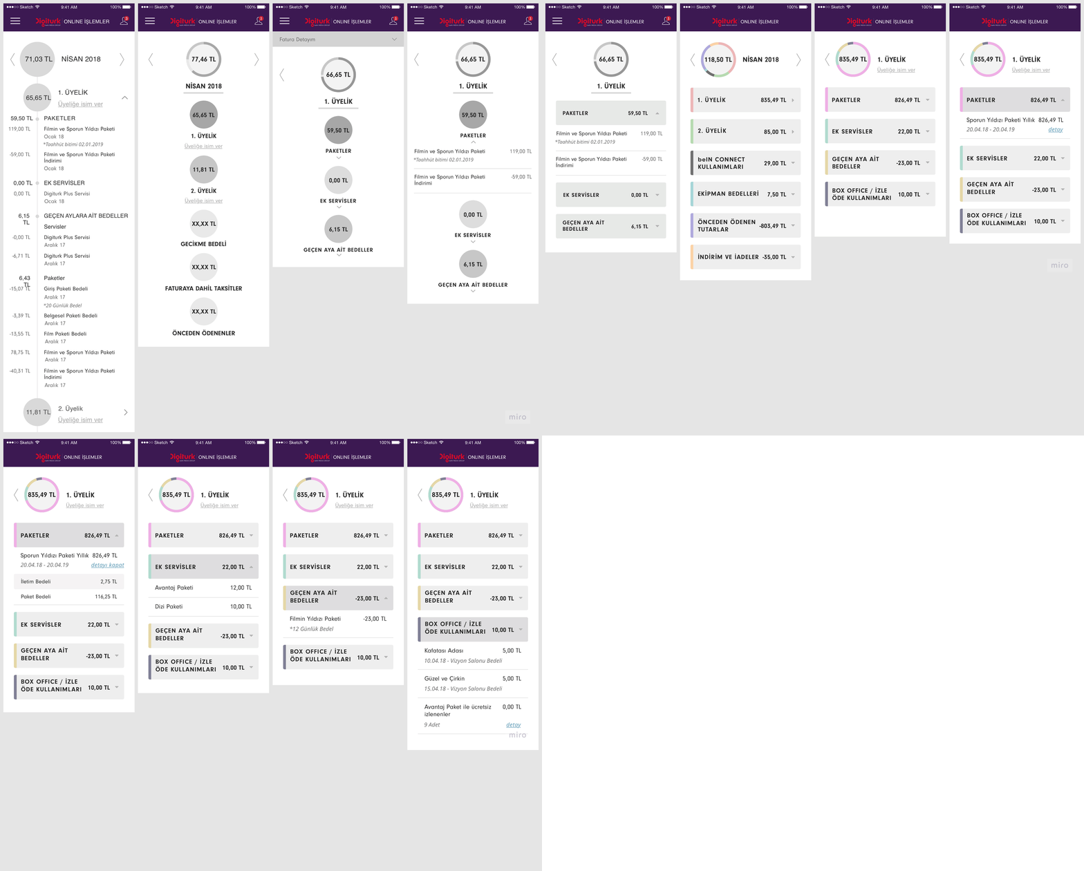
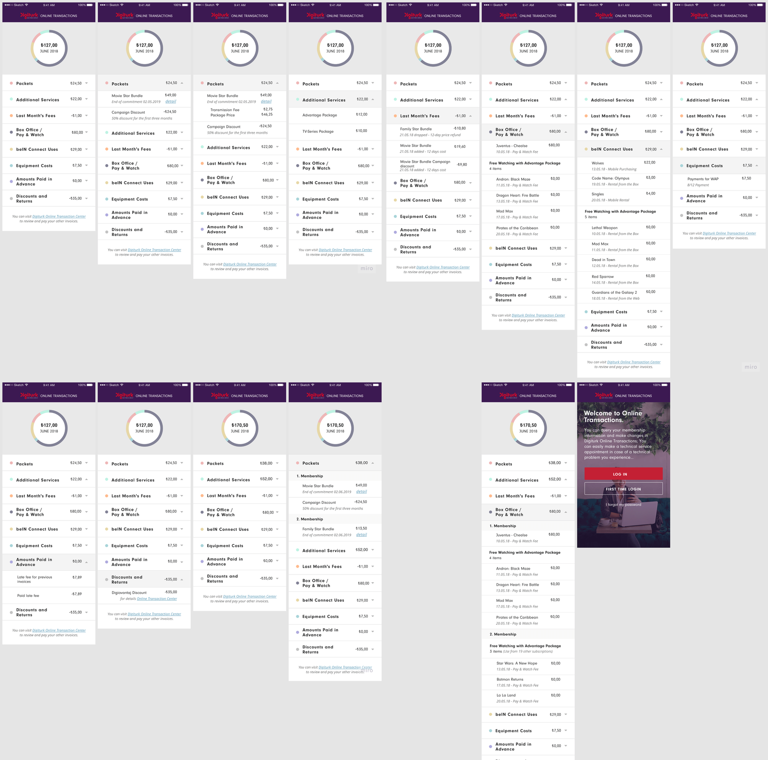
Interactive prototypes were built for usability testing and stakeholder alignment. Feedback led to refinements around terminology and grouping logic.
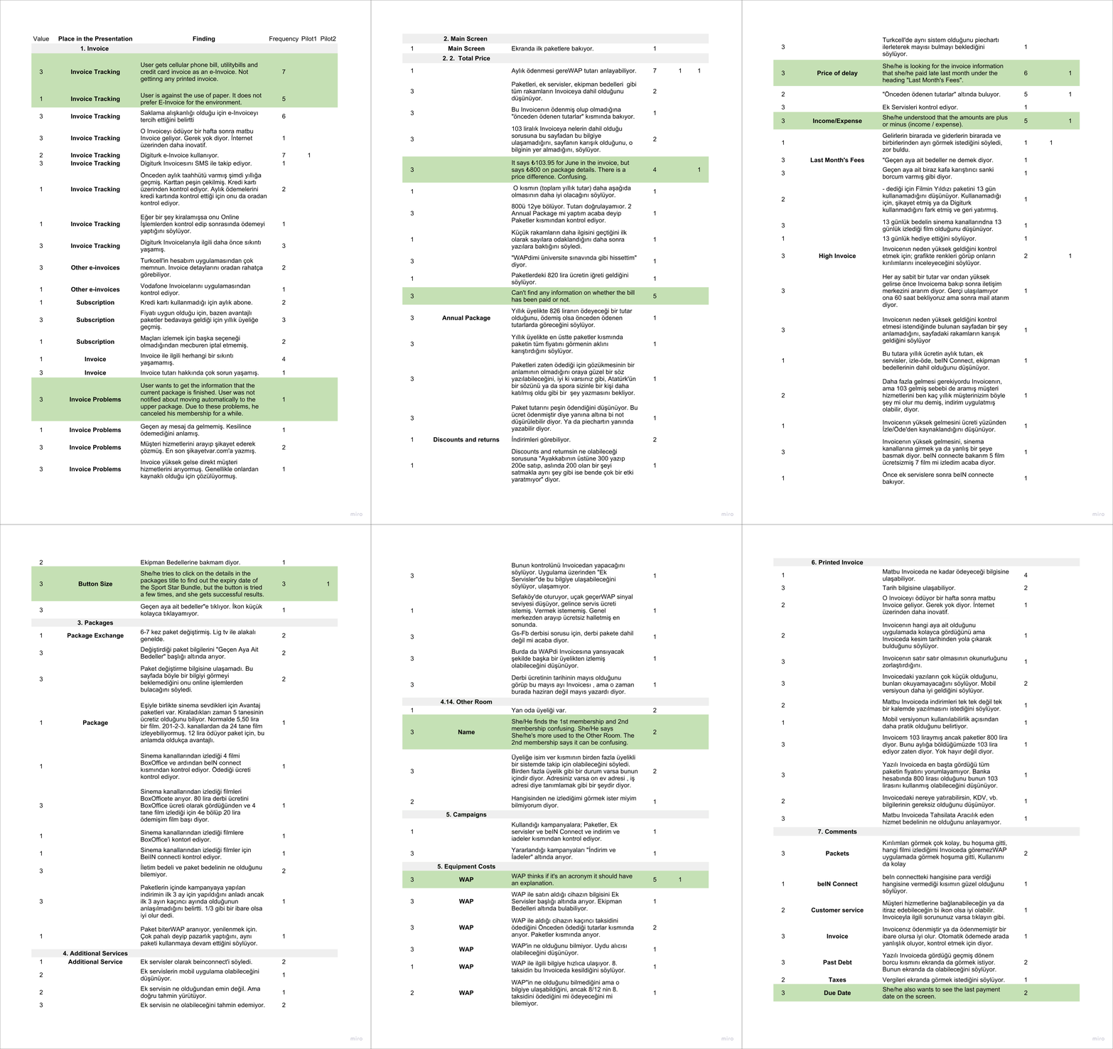
I interviewed 8 Digiturk users with targeted usability tests. I explored areas like:
🟢 Prioritized insights were identified and validated in collaboration with stakeholders.
Finalized high-fidelity designs in Sketch and handed off via Zeplin.
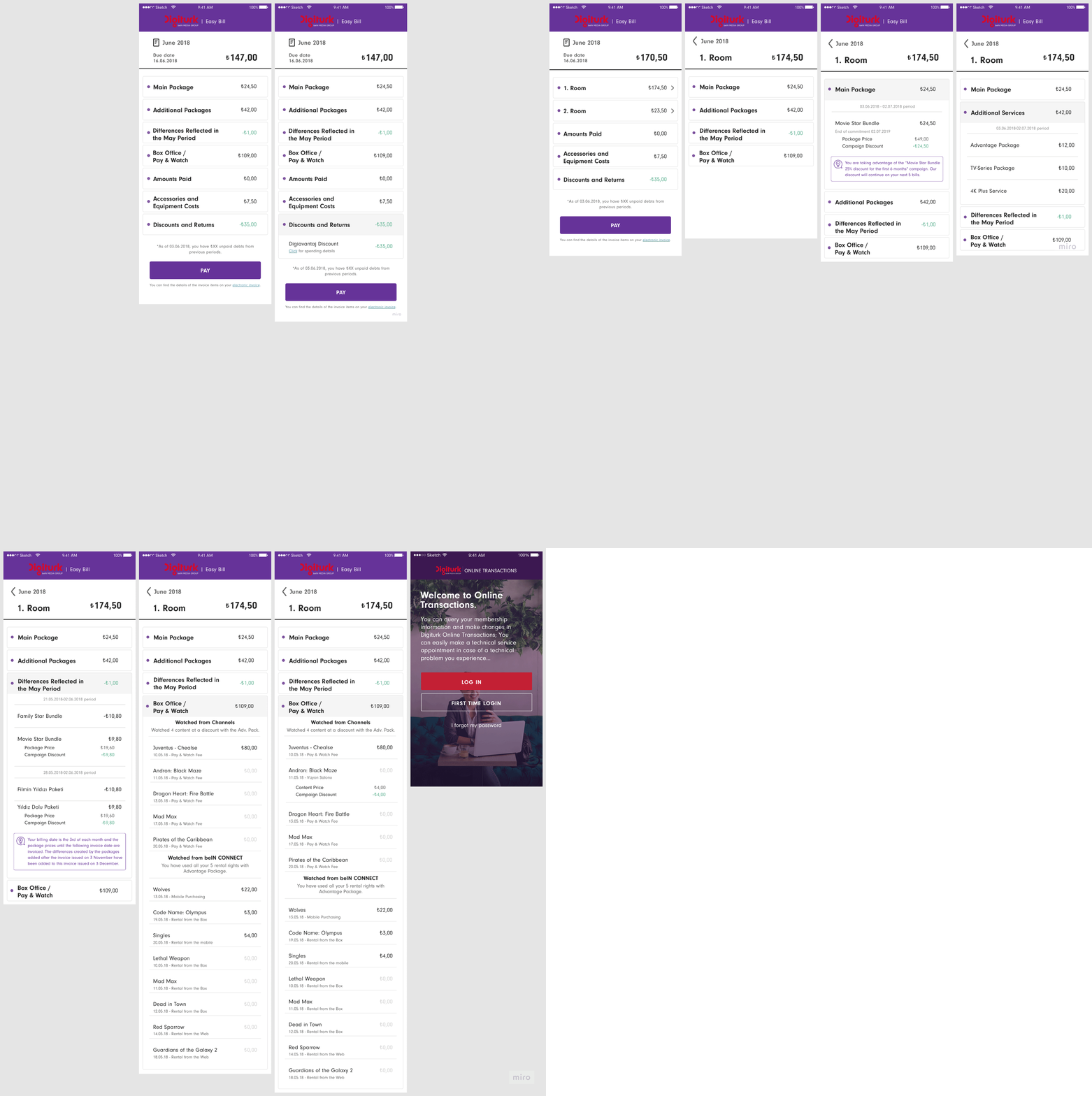
✅ +50% increase in user engagement with digital invoices
✅ -25% drop in invoice-related user complaints
✅ Created a design system foundation for future Digiturk mobile tools
This project reinforced the power of user research and iteration. Small interface tweaks, like changing terminology and adding tooltips, significantly impacted usability. I also learned the value of cross-functional collaboration, especially with finance and customer support teams to deeply understand the problem.