Markafoni, once Turkey’s leading fashion e-commerce platform, had a growing issue: Users were frustrated with the checkout process. There were frequent call center complaints and abandoned carts due to unclear delivery messaging and incomplete credit card registration steps.
The core challenges:
No visual or textual explanation for partial deliveries
Inconsistent checkout flows across platforms
Missing credit card registration steps, leading to failed checkouts
Multiple user pain points causing order cancellations and support tickets
🎯 The Goal
Streamline the cart and checkout flow for all platforms
Reduce user confusion around delivery dates
Improve the visibility of key steps like credit card saving
Reduce support calls and cancellations
Improve checkout speed and overall satisfaction
💡 My Role
As a Senior UX/UI Designer, I worked cross-functionally with Product and Front-End teams. I was responsible for:
Root cause analysis and heuristic evaluation
Designing cross-platform wireframes
Building flows, prototypes, and final UI
Running and analyzing user tests
Delivering designs via Zeplin for handoff
🔍 Discovery & Research
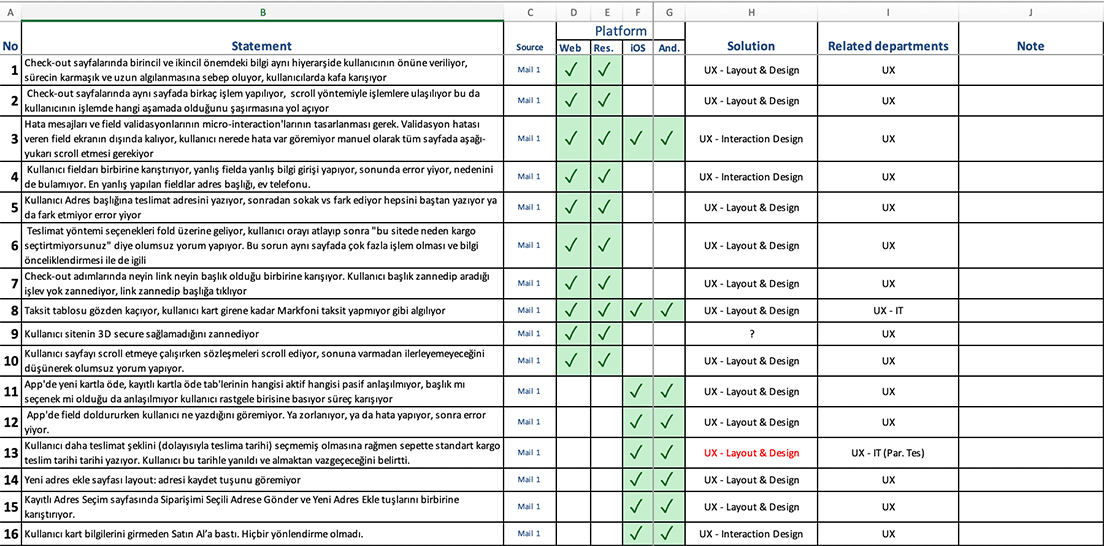
I conducted a root cause analysis across mobile and desktop platforms.
Findings were grouped by platform (iOS, Android, Web) and presented to the Product Owner for prioritization.
Key insights:
Users were confused when orders included multiple items with separate delivery dates
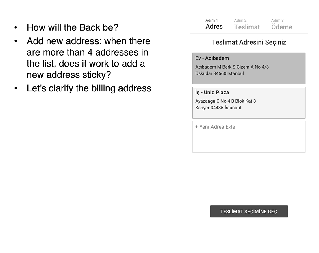
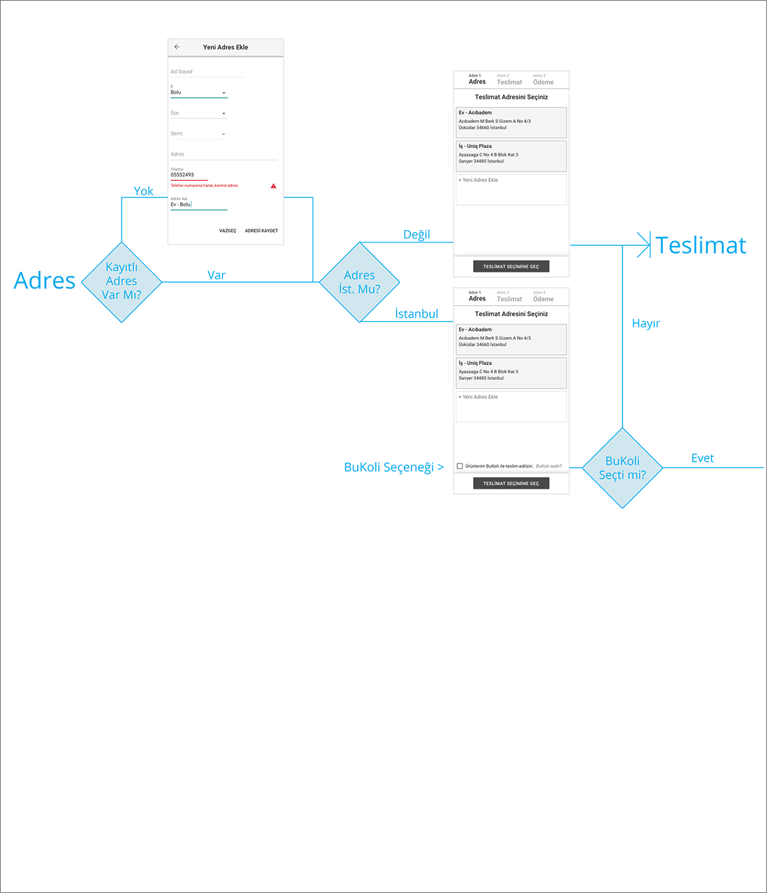
There was no way to choose different delivery addresses (home/work)
Users expected an option to register cards, but it wasn’t part of the existing flow
The overall journey felt fragmented and inconsistent
✍️ UX Strategy & Wireframes
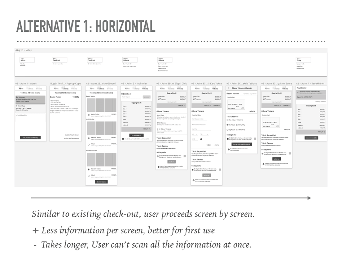
I created phase 1 wireframes based on prioritized pain points.
Used heuristic evaluation to identify friction points and test usability best practices.
UX scenarios explored:
Clear communication of partial delivery situations
Adding a card registration step post-purchase or pre-payment
Supporting multiple delivery address selections
Each issue was mapped into a visual user flow, helping stakeholders and dev teams grasp the new journey and estimate the workload. The flow charts clarified overlapping features and allowed for smoother implementation.
🧪 Prototypes & User Testing
Created 2 alternative wireframe versions
Prototyped using InVision
Conducted in-person testing with real users at a Markafoni retail store
Collected usability feedback in 1 day and eliminated the weaker concept
🎨 Final UI & Delivery
Designed the selected concept in Sketch
Held short, iterative feedback loops with stakeholders
Integrated all final screens into Zeplin for seamless handoff
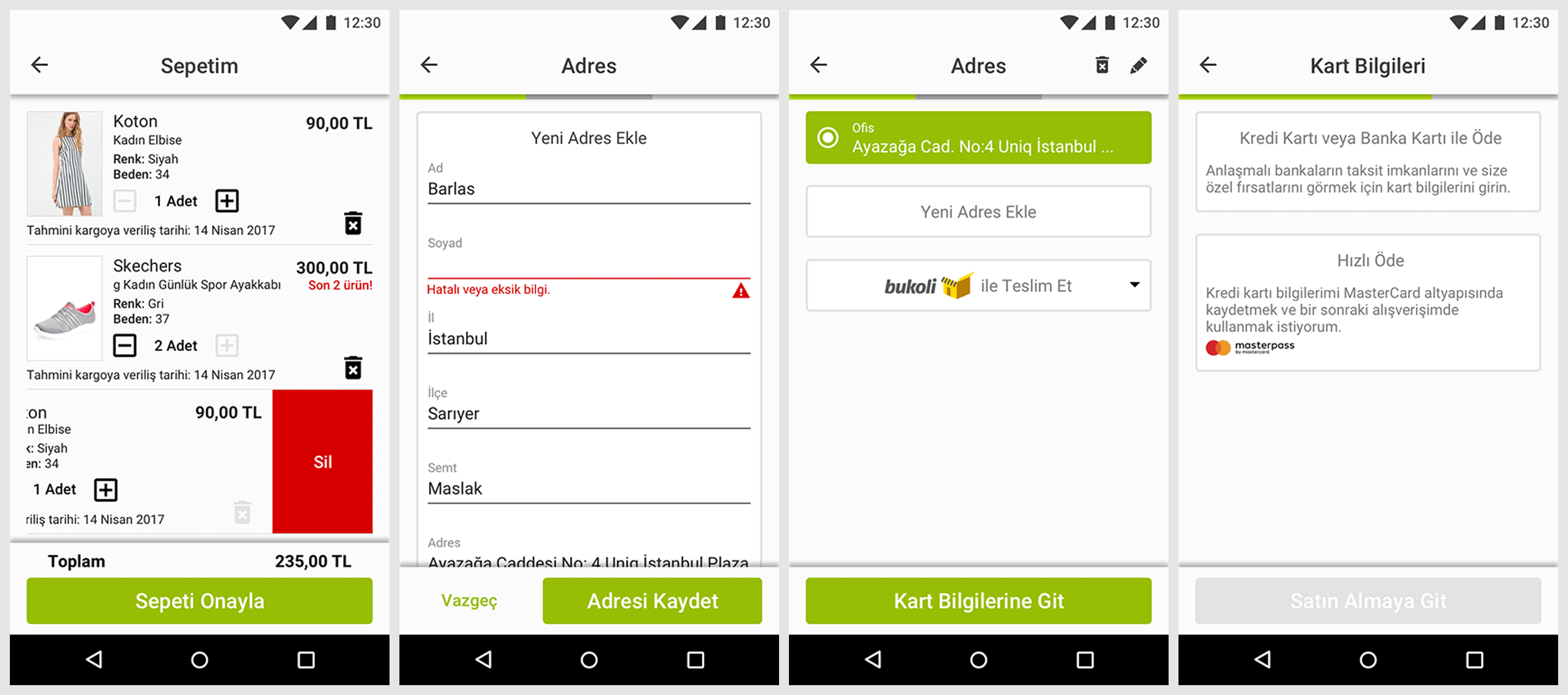
(The final UI shown is for iOS, but all platforms were addressed.)
📊 Results & Impact
✅ +50% faster checkout times after launch
📉 -25% drop in user complaints about checkout
🙋♂️ Conducted 15+ user tests across flows and platforms
💳 Successfully added a card registration step, reducing payment errors
🧠 Reflections & Learnings
This project reinforced the power of zooming out and mapping the full user journey. What initially seemed like UI tweaks revealed core flow issues that affected trust and conversion.
Involving real users early and visualizing flows helped align product and engineering teams—and led to measurable business wins.